Promoting
partner
content
@

I
led
the
development
and
testing
of
an
integrated
monetization
feature
to
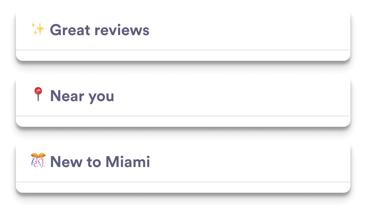
promote
partner-sponsored
venues
and
events
without
degrading
user
engagement.
Role:
UX Lead
Duration:
4 weeks
Skills:
UX:UI
design,
quant
methods,
qual
methods,
prototyping
Tools:
Figma,
Figjam,
Mixpanel,
Zoom,
Typeform
OneSignal


.png)