
I
streamlined
Clyx's
event
creation
flow
to
broaden
the
context
of
what
an
event
can
be,
increase
UGC
volume
&
empower
more
users
to
become
creators.
Role:
UX Lead
Duration:
4 weeks
Skills:
Quant
methods,
interviews,
UX/UI,
prototyping,
usability
testing,
PRDs
Tools:
Figma,
Figjam,
Notion,
Mixpanel,
Zoom,
Typeform,
OneSignal

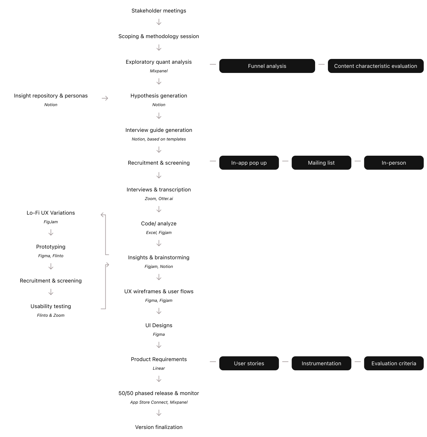
As UX Lead, I led the end-to-end process from identifying the conversion problem through to designing, and testing. This included analyzing behavioral data, conducting user interviews, designing solutions, and working closely with growth and engineering to ship and iterate quickly. My focus was on linking user behavior to measurable content growth outcomes.
Clyx has two event content sources: partners, and users. While partner events bring in revenue, user events build culture. We wanted users to land on the home page and see a buzzing network full of social proof.
The majority of users open the creation flow during their lifecycle but only a minority complete the process and organize an in-person event.
How do we encourage more users to post without degrading event quality?
+20% Conversion
% of active users that have created an event
+30%
Completion
% of creation flow starts that end in completion
0% change in avg. event engagement
% difference in avg. engagement per UGC event
To understand why more users weren't creating events, I first conducted exploratory data analysis of the creation funnel and the kinds of events being created. This indicated that the significant majority of content was for large organized events. Equally, those completing the creation flow tended to specify most or all event parameters despite the ability to skip. Everyone else dropped off during one of the detail selection pages. Further, we had previously identified small-event hosts as an underserved user segment in the social event app market. Based on these insights, I generated two hypotheses:
H1: Users are overestimating what a Clyx event can be, ignoring the possibility of posting or joining casual 'hang out' content as opposed to organized events.
H2: The linear creation flow with step-wise pages for each event parameter, even when skippable, is the cause of this overestimation.
To validate H1, I conducted semi-structured interviews with existing users, focusing on how they currently perceive Clyx events and their preferences around event formality. I then generated prototype variations to evaluate the existing flow against alternate architectures that prioritize flexibility and more clearly support casual events.
Quantitative
How long do users take in each phase and overall?
Qualitative
Where in the flow are users getting stuck?
Qualitative
How confident do users feel while using it?
Qualitative
Which flows do user prefer using?
Flow structure (linear vs hub-based)
Number of mandatory fields
Order and grouping of information
Default options
Perceived formality of Clyx's event content
Willingness to post events at different levels of event finalization
Willingness to join events at different levels of event finalization
Perceived event quality at different levels of event finalization
From usability testing
Users struggled with too many detail options
Users frequently slowed down or got stuck while filling in event details that may be unconfirmed, slow to source, or irrelevant to their event.
From usability testing & interviews
The previous linear flow increased perceived effort
Having users go page to page filling in details increased perceived effort even if they could skip fields.
From interviews
Users overestimated formality
Having too many required inputs produced overestimations of formality, unnecessarily raising the bar for what a Clyx event could be.
From usage analytics & interviews
The benefit of finalizing before posting was negligible
Users were happy to join events and help finalize the details based on what worked for the group.
Insight-driven brainstorming
After researching, we developed a pool of possible solutions backed by our insights.

Affinity
Mapping
To synthesise our potential solutions, we thematically grouped them to combine overlapping options.

Development cost analysis
Finally, we compared expected dev costs to find the right balance of cost and potential benefit.

The solution focused on reducing both actual and perceived friction while expanding the definition of what an event could be. We began the design process by creating wireframes - focusing on information architecture while minimising development cost.
The primary distinction against the original flow was switching from a linear flow to a hub with subsidiary details pages.
Further, rather than requiring users to fully define an event upfront, the flow was redesigned to allow users to post quickly and refine details later using existing event detail management flows.


Primary event details
Straight to the point
The only required detail is the event title which is prominently displayed at the top.

Secondary event details
Simple by default
Time & place are given defaults, enabling users to decide now or later.

Tertiary event details
Easy access
All the extra detail options are out of the way but easily accessible.

Conversion
+75%
Higher conversion from user to content-creator
9.07% -> 15.87%, 6.8ppt uplift
Completion
+24%
Higher completion rate from opening to posting
48% -> 59.5%, 11.5ppt uplift
Downstream side effects
~0%
Decrease in avg. joins per UGC event
No significant difference


Straight to the point
The only required detail is the event title which is prominently displayed at the top
Simple defaults
Time & place are given defaults, enabling users to decide now or later
Easy access
All the extra detail options are out of the way but easily accessible